Sunday, December 21, 2008

Beneficial, ubiquitous interactivity

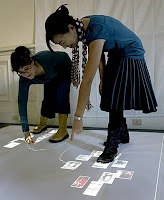
Earlier this month, I dropped by an exhibition of masters student projects from the "Theory and Practice of Tangible User Interfaces" course at UC Berkeley. While waiting for the exhibition to open, Liz Goodman, teaching assistant for the course (that is her to the right side of instructor Kimiko Ryokai in a photo from the San Franciso Chronicle) told me about students' desire in this kind of course to take on projects of great importance, though such projects are often very difficult to figure out. Liz's words reminded me of some of Jon Kolko's words from our September+October 2008 edition of interactions cafe (in interactions magazine) entitled, "On Addressing Wicked Problems...":
"When I used to teach, my students would become enamored with the possibilities of design, and would make grandiose, and unintentionally trivializing statements like 'World hunger? It's just a design problem; we could solve it, if only we had the right model...'"
According to Liz, the challenging project of greatest popularity this year involved monitoring home energy use. However, only one group of students stuck with such a project, creating a demo of an energy monitoring system interface via which residents of an apartment building could see how much energy is being used in different apartments. The visual display showing energy use by apartment -- to be placed in a common space of an apartment building -- did not reveal the identity of any apartment unless an apartment resident approached with a device which enabled the display to identify only his or her own apartment. The student designers wondered whether multiple residents would take the opportunity to approach the interface simultaneously to discuss their relative energy use and what might be done to lower it and that of others.

(Two energy monitors for use inside a home were among products already on the market reviewed by James Pierce and David Roedl in "Changing Energy Use Through Design," the cover story of our July+August 2008 issue of interactions magazine. One of them is the Wattson home energy monitor pictured at left, which, among other things, enables people to be peripherally aware of their energy usage via the color and pulse of its mood light. "The novelty of this ambient energy awareness may stimulate reflection, behavioral change, and conversation.")

The foci of the other UC Berkeley student projects were very different, ranging from digital shadows of personal information that follow people around to cafe table surfaces that remember and remind you of how you make use of them. A mockup of a system via which students can unobtrusively communicate their views of the appropriateness of the pace of a class to its instructor reminded me of a system developed by Eric Paulos via which conference attendees can use their cell phones to communicate their presence or absence in the conference hall, how they are feeling, or their vote on an issue raised by a speaker; for both systems, the individual communications impact a display visible to all attendees, such as the display of attendees pictured at the right.
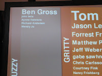
Eric's system was used during the Interactive City Summit held in San Francisco during 2006, an event that critically examined the rhetoric comprising "a future vision filled with beautiful, delicious urban technologies that will sooth the souls of our communities, generate playful neo-geo-landscapes, and celebrate our omni-connected harmony." The summit immediately preceded "a global festival of art on the edge" a few miles south of San Francisco in San Jose, where just a week and a half ago was unveiled a large piece of art consisting of thousands of LED lights that change color and pulse and pattern in response to codes communicated via the phone of anyone who chooses to call. The artwork, called "Show your Stripes," occupies the surface of the outside of a high-rise building.

Will "Show your Stripes" sooth the souls of the San Jose community?

An interactive light installation in the U.K. perhaps achieved this type of goal and other important goals much more. From "Dancing in the Streets" (interactions, May+June 2008):
"How do you transform a city center at night to enhance the experience of residents and visitors and to combat the public's fears over safety and security at night?

This challenge was set by York City Council’s ‘Renaissance Project: Illuminating York’, and we took them up on it. We made it our goal to get pedestirans to engage with our interactive light installation, and to get them dancing without even realizing it.

People out shopping or on their way to restaurants and nightclubs found themselves followed by ghostly footprints, chased by brightly-colored butterflies, playing football with balls of light, or linked together by a ‘cat’s cradle’ of colored lines. As they moved within the light projections, participants found that they were literally dancing in the streets!"
A video of this dancing is available on the interactions website. And you can read more and watch a video about some of the UC Berkeley student projects in an online San Francisco Chronicle story entitled, "Tangible fun at UC Berkeley's virtual projects."

(Note that according to Liz, one of guest speakers during the UC Berkeley course was her husband, Mike Kuniavsky, whose presentation in class was based on an article of his entitled, "User Experience Design for Ubiquitous Computing" from the November+December 2008 issue of -- you guessed it -- interactions magazine.)

Thursday, December 11, 2008

Applying "design thinking" to, um, design

"The Omnibox is really great; thanks for coming up with that" said my friend Pam from Tuesday evening's BayCHI audience. "But what's up with the tabs? I've watched numerous people be confused by and just ignore them. Do people really use them?"

Pam, unknowingly sitting immediately behind the Firefox design team (Firefox also uses the tabs metaphor), was asking this of Google's Glen Murphy, who had just described the process of designing Google Chrome -- Google's new browser -- to a near capacity audience at PARC. Much of his description had been focused on the meticulous process of designing Chrome's tabs. But why tabs? Glen had said that the team had settled on use of the tab metaphor very quickly, emphasizing that it just seemed right to everybody. What other options were explored and considered?

Glen had repeatedly stressed the value of user research during the design process, saying that he couldn't overstate the importance of the many "cognitive walkthroughs, lab usability tests, and longitudinal studies" that were conducted. But did the team generate and seriously explore and test many concepts other than tabs?

Doing so is often an important part of a good design process, certainly one of relevance to the design of Google Chrome. Indeed, it reflects an application of "design thinking," something I've written about in previous posts (e.g., "Crummy innovation") and in interactions magazine (e.g., "On Addressing Wicked Problems..."). Business professionals are hearing lots these days about the importance of applying design thinking to business decision making -- a process typically dominated by analytical thinking.

But another good time to apply design thinking is, um, during product design.

Note that I'm certainly NOT claiming that it wasn't applied during the design of Google Chrome. For all I know, lots of concepts other than tabs were generated and explored. I should have asked. But I do know that the generation and exploration of multiple design concepts happens much too little in many engineering-centric companies.

I did ask a question of Glen. However, my question focused on the role product management played during this project. Glen had stated that the Chrome team was comprised of people from engineering, user experience, and product management (though he was not permitted to reveal how many from each). Glen had also stressed the importance of the close relationship that was maintained among engineers, designers, and users throughout the project (see his slide to the right); for example, the engineers observed every user study conducted by user research personnel -- something which is, indeed, probably still far from the norm. I wanted to know what product management was doing during the project, since it didn't appear to be represented in that important slide (though I would tend to want to see it there).

Glen had also emphasized the importance of the interchangeability of roles at Google, saying this was his first project in the role of designer at Google, having been in the role of engineer on previous projects. According to Glen, this interchangeability facilitated the important closeness of the relationship between designers and engineers.

But one can be in the role of designer without extensively applying "design thinking," which, again, I say WITHOUT implying that was true in this case. But when it is true or is likely to be true, there are things that can be done to increase its application.

At the recent CanUX workshop (which I didn't attend), Jerome Ryckborst presented an approach he developed for use in the company at which he works. Here is what Jerome said about this on the Vancouver User Experience discussion list in September:
"Over a year ago, our CTO decided we would not hire a designer to support our 100 software developers, and declared that the UI was ultimately the responsibility of developers. The problem I saw with this: developers untrained in design believe they're designing their software, but they actually aren't doing things that designers would recognise as design activities. I took this as a challenge because I didn't want Usability to be the mop-and-bucket brigade at the end of the development process. I set out to improve the outcomes of our developers' design efforts. ... With the help of my colleagues and the ideas of various experts, we assembled, tested, and refined an ideation-design process specifically for software developers.

You, too, can learn and use this process."
Jerome's CanUX 2008 slides, which describe his process quite nicely, are presently accessible on the CanUX 2008 homepage. Labeled "Five-Sketches-or-Else," the process consists of a series of activities (some of which are iterated) which facilitate the generation and exploration of design concepts, preventing settling on a single concept much too quickly.

Also at CanUX 2008, Brandon Shauer talked about the sketchboarding technique I referenced recently in "Prototyping for tiny fingers." It, too, facilitates the generation and exploration of design concepts.

And there are other approaches that can be taken, some of which I've described in previous blog entries and where the best choice of an approach can depend on a variety of factors. But common to these approaches is facilitation of the approaches by "UX" personnel. As I've argued often (see, for example, "Soft skills"), UX personnel need to be able to play the role of facilitator of a good research and design process involving non-UX personnel as much as if not more so than doing the research and/or design themselves.

Is "design thinking" being applied during the product (or service) design process where you work? If you need some help with this, give me a holler.

Wednesday, November 19, 2008

Prototyping for tiny fingers

Knowing I will never again use any of the papers, books, magazines, etc. that sit in several boxes I have stored in the basement, I decided that the time had come to get rid of them all.

However, I made the mistake of looking inside the boxes.

Ah, a couple dozen unused Group Embedded Figures Tests. Ooh -- those are cool. Hmm... you never know when I'll need to find out the relative field dependence-independence of a group of guests. It might provide critical guidance regarding how to set the dinner table and seat people around it.

Just before dinner, those guests -- or just the field dependent among them -- might want to leaf through the dozens of old Gourmet magazines I have, if I were to dust them all off a bit. The field independent guests might prefer that Theory of Matrices textbook from my undergraduate days, or perhaps Introduction to Computer Organization and Data Structures: PDP-11 Edition.

During dinner, I might want to do a reading from the article I co-authored that appeared in Journal of Educational Measurement many years ago. All those reprints in the basement, which I'd be happy to sign, could make unforgettable thank-you gifts.

That proposal for additional design and evaluation work for LAWS (a Legal Agreement Writing System) that I worked on for Pacific Bell during the 80s might be just what I need to take a look at again someday. And the code for that PLATO-based "confidence testing" system that I redesigned even earlier during my career... -- well, I'm sure I would think of a good use for that right after I discarded it.

But what is this? Ugh -- a box of old issues of Communications of the ACM. Finally something I should be able to discard; nothing could be in them that I'd ever be interested in reading again (or, more likely, for the first time). But wait -- post-its protrude from the top of a few of them. Might there actually be something of remaining value in some of them, such as in this issue dated April 1994? Sure enough, the answer: "yes" (though a far more genuine "yes" than applicable to any of the items mentioned above).

The marked article: "Prototyping for Tiny Fingers," an article about the value of low-fidelity (paper) prototypes, and how to build and test them. Though published in 1994, this is still an excellent article, and is among the articles on paper prototyping that I provided to user experience personnel who worked for me at Yahoo! as recently as 4 years ago. They adopted and adapted the approach to great benefit, generating good, new designs much more quickly (though much more intensely) and resolving old design problems that had long haunted them.

The article was written by my friend Marc Rettig, who was perhaps the first Chief Experience Officer in the world (though years after he wrote this article). Yesterday, I decided to check in with Marc about the article. Here is what he had to say:
"It has been really surprising to see how long that piece has remained useful to people. I've often thought of it as a sort of indicator of just how much people want short, clear, egoless descriptions of ways of working that have power to make things better.

What would I change about it today? Hmmm.... Remember that it was written before the web. About '93 or so, I think. At the time, the new news in that column wasn't just using paper to make prototypes, it was the idea of prototyping at all. Of course people had been making prototypes since forever, but in the software world, it wasn't *really* happening very often. When it did, the prototype itself was usually an expensive piece of code.

So the industry was having a conversation about a shift from waterfall processes, from 'first specify, then build,' to a recognition that iteration is *necessary* for discovering the specifications. That you can NOT write complete specs without using attempts-to-build as a way to better understand both the problem and the solution, and the faster you do this the better. Damn cheeky claims back then.

I don't think that conversation is over, by the way. I think design and construction are still typically too separated. And our tools make it difficult to continue design into the construction effort. Once you see and experience the software or product, once you see it in use, you can usually see how to improve it. People are slapping themselves on the forehead in usability observation rooms around the world. 'Why didn't we see that before?!'

When you make paper prototypes, design and construction are mingled in a lovely useful way. And it's an activity that easily affords collaboration. Still the two strong points in its favor, IMHO."
I never understood Marc's title for this article, so I asked him to explain it:
"Why 'tiny fingers?' You know, I thought a lot more people would understand that reference. Maybe it says something about my childhood. To me, 'tiny fingers' is a cultural reference to books about "adult" topics made accessible for children. And if "tiny fingers" is in the title, chances are you're going to be doing some kind of activity. You're going to get out the scissors and paste. I thought I was writing a title that packaged two things that usually don't go together: a 'serious' topic like prototyping, and an invitation to playful craft as a way of working. Plus I can't bring myself to make titles (or even articles) that take themselves too seriously. There's way too much over-inflation in our literature, and remember this was CACM. I wish I could have called it, 'None of us really know what we are doing.'

I asked amazon and google about this, and see it's still happening a little:
  • Easy puzzles for tiny fingers
  • Kitten on the keys: Descriptive solo for tiny fingers (!)
  • Dude, you have tiny fingers
Okay, I made up that last one."
But, surely no one is doing much paper prototyping any longer, right? Not according to Nathan Moody and Darren David of Stimulant who design cutting edge, multi-touch natural user interfaces. At their IxDA-SF presentation last month ("Multi-Everything: Multi-touch and the NUI Paradigm"), both claimed they paper prototype extensively and have never found anyone who can iterate faster digitally.

Marc "tipped his hat" to Bill Buxton, who wrote the fabulous and recently-published book, "Sketching User Experiences: getting the design right and the right design." However, Bill distinguishes between sketches and prototypes, arguing that they serve different purposes and are used most at different stages of the design process -- the former for ideation, the latter for increasing usability. Regardless, paper is among the tools he advocates for both.

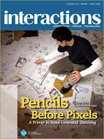
I encourage you to also take a look at Mark Baskinger's excellent cover story in the March+April 2008 issue of interactions magazine. The title: "Pencils Before Pixels: A Primer in Hand-Generated Sketching." You can download Mark's worksheets from the interactions magazine website.

And other lo-fi techniques have received recent attention, including Brandon Shauer's sketchboards for exploring and evaluating interaction concepts quickly.

Over the years, lo-fi prototyping has had more than its share of detractors. But, clearly, it lives on -- as it should.

However, it looks like it is going to be very hard to get rid of any of those boxes in my basement.

___

Years ago, Marc Rettig served as Features Editor for interactions magazine, though he tells me the opportunity he was given to play that role was less than minimal. Jon Kolko and I are giving him another opportunity, as we have recently added Marc and others to our team of contributing editors. More info on those additions and other changes will appear in interactions magazine and on the interactions website.

Tuesday, November 04, 2008

Crummy innovation

What is innovation that doesn't happen? "Crummy innovation," according to Roger Martin (at right in the photo), Dean of the Rotman School of Management at the University of Toronto.

Roger said this last evening during an on-stage conversation with Cheskin's Darrel Rhea (at left in the photo, sitting to Roger's right) hosted by the Commonwealth Club in San Francisco. Darrel had just said that the greatest innovations he had worked on during his career were never implemented, because the organizations that needed to implement them were too resistant to change. However, according to Roger, great innovations happen, because if they don't, you will never know whether they would have been great. "No new idea can be proven in advance," argued Roger. "Only the passage of time will prove whether an idea -- an innovation -- is great."

Hence, Roger argues that companies need to ban the use of two words when it comes to innovation: "prove it." If you can prove something in advance, it is not an innovation.

Additionally, Roger argues that a critical part of the innovation process that is often overlooked is the decision making process that determines whether an innovation will be implemented. It, too, must be designed.

Both pose great challenges.

In our most recent issue -- the November+December 2008 issue -- of interactions magazine, Nathan Shedroff (one of Darrel's co-authors of the book, Making Meaning: How Successful Businesses Deliver Meaningful Customer Experiences) describes several reasons why most organizations cannot innovate effectively (see "Design: A Better Path to Innovation"). Roger Martin has addressed this, also. For example, in my blog entry, "Preconceived notions," I wrote about Roger's presentation at the CONNECTING 07 World Design Congress:
"Roger Martin, whom I referenced extensively in 'Designing in hostile territory,' explained how the common notion that risk needs to be minimized for a business to be successful is a hindrance to innovation and development of competitive advantage."
Last evening, Roger touched on the importance of applying "design thinking" -- involving the use of abductive logic -- to the business decision making process, which is typically analytical involving the application of only deductive and inductive logic. And according to Roger, helping designers and MBAs understand the differences in the logic they have been taught to apply, and the value and role of all three, can increase the chances that innovation will not end up being "crummy."

There is much more that can be done, as I've described in past blog entries and addressed in courses, presentations, and consulting gigs. What needs to be done where you work so that your innovations don't end up being "crummy"? Do you need some help figuring this out?

And how should you approach the innovation process to increase the chances that it is not best for an innovation to end up being "crummy"? (The title of Nathan's article should suggest a good answer.)

___

Innovation receives a lot of attention in the November+December 2008 issue of interactions magazine. Nathan's excellent article appears in a section entitled, "Reflections on Innovation," which includes Steve Portigal's "Some Different Approaches to Making Stuff," Elizabeth Churchill's "Of Candied Herbs and Happy Babies: Seeking and Searching on Your Own Terms," Bill Tomlinson's "A Call for Pro-Environmental Conspicuous Consumption in the Online World," and Richard Pew's "An Exciting Interface Foray into Early Digital Music: The Kurzweil 250." Other articles also address innovation, particularly, and not surprisingly, those in a section entitled, "Emerging Approaches to Research and Design Practice." For example, Sus Lundgren describes tools via which to design innovative games in "Designing Games: Why and How," and Liz Sanders' "An Evolving Map of Design Practice and Design Research" makes reference to the most recent additions to that map.

We've addressed innovation in each of our previous issues of interactions magazine (the preceding 5 issues of 2008), and we'll no doubt do so in each upcoming issue. Indeed, look for an article from Roger Martin in an upcoming issue.

Some of the blog entries in which I address innovation can be accessed here.

Friday, October 31, 2008

On facilitating a jury's deliberations, and more

As I've described in past blog posts, I love to facilitate group sessions of all sorts of types. Earlier this week, I found myself in the unusual position of facilitating a very important group session in a building designed by none other than Frank Lloyd Wright and in the role of jury foreman.

I've served on a jury before, but never as a jury foreman. And I hesitated a little bit when my fellow jurors quickly asked me to be their foreman (or presiding juror, as they are sometimes called here in the U.S.), because the task before us -- placing monetary value on the plaintiff's past and future medical expenses, past and future loss of income, and past and future "pain and suffering" was going to be challenging, even more challenging than we all knew at the time of making this initial decision. But it was because it was going to be challenging, and because I knew of the importance of a good facilitator to this process, that I agreed to take on the role. And I'm glad I did so. Our work was intense, with lots of differing viewpoints among the jurors, but we finished our job in a single day, much to the surprise of us all.

I learned a lot during this trial, particularly about the spine and spinal surgery and various approaches to pain management. My university human anatomy and physiology instructors of years ago were pitiful in comparison to the lawyers and surgeons and other medical experts we heard from over a two week period.

But there were things that happened during the trial that were very dumb. Perhaps I should say that there were things that should have happened during the trial that didn't, and possibly never would in this type of judicial system.

One of the problems was that we, the jurors, were not permitted to ask questions of the witnesses. Of course, we didn't expect to be able to ask questions of the witnesses. But most of us wanted to be able to do so, as there were questions that needed to be asked that weren't, and questions that were answered in ways that were less than clear. Could a means be devised via which jurors could ask questions in a way that wouldn't create a big mess? I think so, but I won't dwell on this issue, since it is minor compared to others.

A bigger problem was that none of the reports prepared by the medical experts, the economists, and others documenting the process and results of medical exams, extensive and rather complicated present-day-value calculations, and more were made available to us during our deliberations. Those reports contained critical information on which we should have been basing some of our decisions, but our access to them was denied.

We watched as all of the reports were tagged as official exhibits during the trial. This led all of us to believe that we would have full access to these reports during our deliberations. However, as we learned at the start of those deliberations, none of the reports had been submitted as official evidence, and only official evidence was available to us in the jury room.

Now that would have been OK -- well, somewhat OK -- had we known this during the trial. Why did they not tell us this? We all would then have been much more diligent about writing down the contents of those reports, much of which had been fully displayed to us on a large screen or on large boards during the testimony of those who prepared the reports (not that we were given enough time to write down everything of importance, but...).

Some of the contents of those reports -- contents that were read aloud by witnesses -- were indirectly available to us in the jury room. Access to those contents required asking the judge to have a court reporter join us to read aloud from the court transcript as we listened in silence. But we were told that our requests had to be very precise; if a requested portion wasn't what we were looking for, we'd need to submit further requests to the judge, as we were not to be permitted to interact with the court reporter in order to help him or her find the information we saught. Plus, we observed witnesses misstating report contents on some occasions; would we remember when this happened and have access to the accurate information via a juror's notes?

An even bigger problem lied in the inability of certain witnesses to interact about the case either prior to or during the trial. For example, the surgeon testifying for the defense was not permitted to interact with the surgeons testifying for the plaintiff. In my opinion, they were all highly competent and well-intentioned doctors. Interaction among them would have enabled them to discuss some very critical uncertainties that could have clarified the picture considerably; indeed, I would have loved to have facilitated that discussion! Instead, it was argued that we should make our judgments about what kinds and numbers of surgery, pain injections, therapy sessions, and more would be needed by the plaintiff over the course of her life by deciding which doctor's credentials appeared to be superior, or how likely it would be that a doctor brought into the process late in the game could really know enough or be telling the truth, or some other equally poor basis.

And then it was all handed over to be decided by a jury of twelve -- all equally well-intentioned, but probably none of whom really wanted to be there, none of whom was adequately paid for being there (only $15/day plus mileage, compared to, for example, the $9000 one witness was paid for half a day), and none of whom had enough of the expertise that really should have been applied to making these decisions. I'm very proud of what the jury did, the process we used, etc. But might there be a better way?

What might that better way involve? Oh, how about working together more, avoiding hand-offs, enabling decision makers to participate (effectively) in the process, providing access to needed data and rationale, etc. -- all things I would recommend and have recommended to be a part of most companies' "user experience" practice, management, and organizational strategy. Are they no less applicable in the U.S. judicial system?

A major theme reflected in contents of our upcoming January+February 2009 issue of interactions magazine is the need for companies to change their ways. As we grow very close to electing a president of the United States seemingly intent on making fundamental changes to the ways things are done in Washington, D.C., perhaps it is appropriate to consider extending that intent outward to the ways things are done in our courtrooms, by insurance companies, by legal teams, and by those whose lives are changed forever negatively, but unintentionally, by others.

___

A couple of additional notes...

I was intrigued by differences between the two lawyers' use of "technology" during the trial. The defendant's lawyer kept it simple, sticking only with writing on flipchart paper and showing us tables from reports (yes, those reports we were not later permitted to see) printed onto large sheets of foamcore (though still often printed too small to be easily readable by the jury). The plaintiff's lawyer, on the other hand, projected computer displays onto a large screen. He zoomed, and he animated, usually quite effectively (though sometimes he could not get the zoom function to work as he wanted). For awhile, he even got away with displaying claims during witness testimony that were not being made by the witness (I was surprised at how long it took for the defendant's attorney to voice an objection, which the judge quickly sustained).

I was also struck by the extent to which practice and "academic" research appear to be intertwined in the medical profession, at least at the level of those who testified during the trial. Sadly, in the world of "user experience" and HCI, we have a situation where many practitioners belittle "academic" research and researchers, and many "academic" researchers belittle practice and practitioners.

Lastly, on Facebook, Matt Jones said that people would be put in the gaol in the U.K. for blogging about their experiences on a jury. Here, jurors are permitted to say as much or as little as they want to anyone about this stuff. Indeed, the lawyers were anxious to take advantage of this immediately after we were all dismissed. They even asked the judge to tell us they wanted to speak with us all, and they stood out in the hallway via which we would exit to intercept us before we could depart. I told them to look for my blog posting.

Tuesday, September 23, 2008

To what extent does where we come from impact where we (can) go?

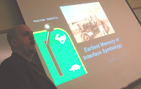
This past spring, Jim Leftwich, Chief Experience Officer at SeeqPod, was a guest speaker at my "User Experience Managers and Executives Speak" course, where he described the evolution of his career, beginning with his childhood encounter with a tractor throttle (see photo). What was striking was the extent to which Jim's approach and way of working was influenced by that encounter and has continued to reflect his experiences growing up on an Iowa farm.

According to Jim, his Dad was a businessman, a veternarian, a carpenter, an engineer, ... -- a little bit of everything. Well, Jim's approach has usually been one of doing most everything himself, and in college, he studied a little bit of everything, including engineering, economics, business, fine arts, photography, psychology, graphics, typology, and industrial design, all of which he continues to apply in his work. Jim told of how his Dad would say, "Let me know what you need, and I'll tell you how to get along without it," a philosophy -- an approach -- reflected in Jim's work throughout his careeer.

To what extent does our work, our approach, our thinking, ... continue to reflect our early experiences?

During the recent IDSA 2008 conference, a surprising number of speakers began their presentations by describing their early experiences and how those early experiences are reflected in their thinking and work today.

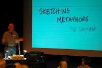
During BayCHI's program two weeks ago, Bill Verplank sketched numerous metaphors, including his definition of "interaction design," a term Bill is credited for having co-coined. Bill has made and presented this sketch before; indeed, you can watch him do so in a video that is available on the webpage corresponding to an interview of Bill that appeared in the book, "Designing Interactions." What was new this time was Bill's statement that he only recently realized his definition of "interaction design" reflected his early days as a controls engineer. And though his definition includes attending to how users feel, Bill stated that the focus of his work has never really moved on to "user experience," which includes an emotional component that was never the focus of his early work.

In the delightful book "Eat Pray Love," Elizabeth Gilbert writes:
"When you are walking down the road in Bali and you pass a stranger, the very first question he or she will ask you is, "Where are you going?" The second question is, "Where are you coming from?" To a Westerner, this can seem like a rather invasive inquiry from a perfect stranger, but they're just trying to get an orientation on you, trying to insert you into the grid for the purposes of security and comfort. If you tell them that you don't know where you're going, or that you're just wandering about randomly, you might instigate a bit of distress in the heart of your new Balinese friend. It's far better to pick some kind of specific direction -- anywhere -- just so everybody feels better."
In a more abstract sense than intended by Elizabeth, is the first question even necessary once you learn the answer to the second? The above stories about Jim, Bill, and several IDSA conference speakers suggest that the answer might be, "no." And it seems to me that most people think the answer is, "no." That is certainly the case of the historical analyst interviewed on National Public Radio recently who argued that the early experiences of the two major U.S. presidential candidates reveal exactly what kind of presidents they would be.

Why am I thinking and writing about this? Well, it was my birthday recently, and as I told a couple of friends, the occurrence of my birthday had led me to become excessively introspective. "Watch out," they wisely responded!

But I think I've long been a bit disturbed by the extent to which people get defined by "where they are coming from" -- that once people reveal that kind of information (whether it is about the geographic area in which they grew up or the profession or professional association in which they "grew up" or the "era" in which they grew up or...), others' preconceived notions of what it means about who they are and "where they are going" or where they can go kick in. Such "preconceived notions," as I described in a blog entry of that title, are very hard to change.

Yet, many of those preconceived notions may have been shaped by early experiences, perhaps explaining their resistance to change.

The relevance of all of this to this blog? Well, this blog is largely about achieving change, as I am certainly in the "change business," helping individuals and organizations change their work practice, management, and organizational strategy via my consulting, teaching, and co-chief-editorship of interactions magazine.

And many have argued that anyone working in this field is or should be in the same change business. For example, in an earlier blog entry about this, I quoted Secil Watson:
"Think of yourselves as change agents. If you like that role, then look at of yourselves as the people who can really change the culture of the organization you are a part of."
Mark Hurst has been arguing for years that changing the organization "is the most important part of user experience work." But he also argues that changing the organization is "the most difficult" part of user experience work.

Indeed, as you probably know, it is usually VERY difficult, which is why there are people like me available to provide guidance.

The huge response to "Eat Pray Love" reveals that Elizabeth Gilbert is in the "change business" as well. Though her "change business" is rather different from mine and yours, perhaps the end of the above quote from her book offers partial guidance regarding how to respond if you haven't yet formulated a good change strategy. In short, "pick some kind of specific direction -- anywhere -- just so everybody feels better."

But then get to work on developing a good change strategy.

Saturday, August 30, 2008

On innovation, appropriateness, intervention design, logic, research, the experience ecosystem, marketing, sustainability, wicked problems, and more

Jon Kolko and I -- Co-Editors-in-Chief of interactions magazine -- end each issue of the magazine with a "cafe" conversation on topics of relevance to the magazine's content. Jon always kicks off these conversations in a provocative but insightful way.

Here are the openings of, and pointers to, our first five "interactions cafe"s:

On Innovation, Appropriateness, Intervention Design, ... (January+February 2008)

Jon: I’m concerned with the overabundance of the word “innovation” in our professional discipline. At CONNECTING ‘07, the theme was neither subtle nor convincing: nearly every speaker talked about innovation (some better than others), yet no one over the course of four days managed to define the term. Apparently, if a business isn’t focused entirely on innovation right now, their business is completely ruined and they won’t be around in a hundred years.

But I’ve recently done a mental inventory of the products, software and services that I use and that I cherish. The items I hold dear to my heart are either one-offs (craft oriented and thus not in the realm of the innovation discussion) or refined and subtle: they are appropriate more than they are innovative. As we see a trend in society towards “slow” design [clearly juxtaposed with fast food culture], the bloat of features and functionality that seem to go hand in hand with being new and different seem dramatically misplaced.

On top of this, the majority of the companies that are clamoring for increased innovation haven’t proven that they can solve the older problem of quality: I don’t need more ‘new’ and ‘innovative’ features in Windows; I just need the bloody thing to work without crashing.

You do a lot of coaching and teaching companies to be more innovative. Why don’t you get them to be more appropriate, or refined, or polished, instead?

Richard: Actually, my coaching and teaching focus on moving “user experience” into a position of greater corporate attention and influence — on helping to enable companies to do the kinds of things Secil Watson describes in her article in our first issue of interactions. Roger Martin referred to this as “intervention design” in his conference plenary on “Design Thinking: The Next Competitive Advantage,” and I’m sure we’ll offer (more) articles on this in future issues.

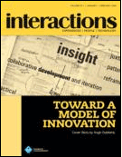
Sometimes such interventions mean helping companies organize and do things in such a way that more appropriate, refined, or polished user experiences will result. But they do sometimes mean helping companies do things so that they can be more innovative. However, innovation can be an important part of making user experiences more appropriate, refined, or polished. I think Hugh Dubberly’s model of innovation in our first issue captures that.

Hugh’s model also addresses the insight required of all of this, stating that “immersion within the context is almost always essential” to achieve such insight. I often coach and advise companies on how to achieve such immersion effectively, and the article by Stefana Broadbent and Valerie Bauwens contributes guidance as well. That article also reveals ethnographic research findings that advise against certain types of innovation since they are likely to yield user experiences that are inappropriate.

Clearly, ethnographic research...

(continue reading "On Innovation, Appropriateness, Intervention Design, ...")

On Logic, Research, Design Synthesis, ... (March+April 2008)

Jon: A core theme of this issue of interactions has been the relationship between Interaction Design and education: how to teach it, how to learn it, and how to live it. As a Designer, I’m obviously biased towards Design Education, as I see Design as a core tenant of life (consider it akin to reading and writing: design has often been characterized as “dreaming” or “problem solving”, both of which I consider underpinnings of human life). At the same time, I see the value in logic and pragmatism, and I’m often challenged professionally to “prove it” or “back it up with a sound, logical argument”. Do you think future generations of professionals in the interaction world will have to walk the line between Art (emotion) and Science (logic), or will Design with a capital D finally have its time to shine?

Richard: Can design truly shine without addressing both emotion and logic? Was a need to walk the line between art and science responsible for all the messes described in the first section of this issue (entitled "The Mess We've Gotten Ourselves Into"), or is the culprit better described as an improper balance?

Roger Martin, whom we referenced in our first “interactions cafe” discussion, has written about how the predominant thinking in business — analytical thinking — is hostile to design, and how that needs to change. But he doesn’t argue that analytical thinking has no place.

Perhaps you can’t “prove it.” Perhaps you shouldn’t be expected to “prove it.” But is it wrong to expect you to develop and use and provide rationale that can be subjected to some form of critique throughout and after the design process?

Is Tracy Fullerton wrong in teaching and emphasizing the importance of playtesting in her Interactive Entertainment program at the USC School of Cinematic Arts? Was Mark Baskinger wrong to observe the elderly and kids in his inclusive design projects? Doesn’t such research contribute to a kind of “logical argument” that is essential?

Jon: I wonder if the word “rationale” should even be part of the designer’s language. ...

(continue reading "On Logic, Research, Design Synthesis, ...")

On the Experience Ecosystem, Drama, Choreography, ... (May+June 2008)

Jon: This issue clearly demonstrates a shift in thinking for practicing designers. Creators of physical, digital, and systematic products are moving away from the development of single, static things and are now considering the larger ecosystem of the experience in which these things are used. This experience lifecycle has even touched on children’s toys, as described by Allison Druin; it is no longer enough to offer products with a narrow focus. Instead, practitioners must “design” the physical artifact, the digital artifact, the system of integration, the unboxing experience and must even consider the urban fabric and culture in which the design is used.

It seems like few, if any, large corporations are organized in a way that supports this tremendous undertaking; the actual experience offering from these corporations is so watered down by the time it makes it to market that all indications of cohesion are lost.

Richard: Years ago I had the good fortune of working at Studio Archetype and Viant, where the focus was on helping clients figure out what to do as much as designing how to do something. Indeed, the Studio’s founder, Clement Mok, wrote a book entitled "Designing Business" back then, and Viant’s primary focus was on developing digital business strategy.

So, the approach to user research that I developed for both companies somewhat naturally looked at the larger ecosystem of the user experience, since that increased our contribution to figuring out what a business should do and facilitated designers’ contribution to the same.

Companies that involve user experience research and design in their business in such ways have a better chance of effectively considering and addressing that bigger picture. Secil Watson wrote of taking such an approach at Wells Fargo in our January+February 2008 issue. But it is hard to pull that off.

You attended Interaction 08 in...

(continue reading "On the Experience Ecosystem, Drama, Choreography, ...")

On Marketing, Sustainability, Pessimism, ... (July+August 2008)

Jon: I’m tired of advertising, and to be completely frank, I’m tired of marketing. The entire infrastructure for corporate marketing has arisen from a desire to convince the public that they need more, faster, better, now. We keep talking about sustainability, but we - and I include myself in this, as I work at a consultancy that makes *things* - keep producing more stuff, and keep thinking about ways to sell versions two and three and four of the stuff to people that don’t really need it in the first place.

What are we doing?

Richard: Change of such great magnitude doesn’t happen overnight. Some of the marketing you are tired of — that which describes what companies are doing to address sustainability — might suggest otherwise, but…

Of course, making “things” won’t go away, but the nature of those things can promote sustainability, as reflected in our cover story. And the way the consultancy you work at responds to clients who want you to make things for them can increase sustainability, as reflected in the Designers Accord described in our May+June issue; indeed, I think you can be proud that that accord was born where you work — frog design.

The Designers Accord is a very important effort, and I...

(continue reading "On Marketing, Sustainability, Pessimism, ...")

On Addressing Wicked Problems... (September+October 2008)

Jon: A lot of the discourse that surrounds interaction design speaks to the large, cultural change it can afford. When I used to teach, my students would become enamored with the possibilities of design, and would make grandiose, and unintentionally trivializing statements like "World hunger? It's just a design problem; we could solve it, if only we had the right model..." This issue of interactions presents a number of these types of problems: homelessness, sustainability, and memory impairment. Do you feel that we actually can solve these wicked, cultural problems through design?

Richard: Design can play an important role. As we suggest in our introduction to this issue design is changing in ways that should increase the role it can play. And increased adoption of "design thinking" by others -- as we've referenced in previous interactions cafes -- will help as well.

But let's take care to not treat design as if it were a religion or a savior. Agile development methodologies, with more than a few fanatical followers, are, in some cases, justifiably decried as little more than an excuse to not document code. The OLPC hasn't had, and is unlikely to have, much of an impact on children's education in developing nations.

Jon: The two examples you give share an interesting commonality. ...

(continue reading "On Addressing Wicked Problems...")

Coming in the November+December 2008 issue: On Mobile Communication, Cultural Norms, ...

Sunday, August 10, 2008

Eliminating noise and confusion

With lots to do -- often much too much to do and not always what would be most beneficial for them to do (as referenced in prior blog entries, including "Realities, dilemmas, framings, ..."), user experience personnel aren't always able to do their best work, which can make them and those with or for whom they are doing the work less than fully satisfied. Past blog entries have referred to some of the ways of dealing with this; recent blog entry suggestions include saying "no," improving soft skills, and offloading certain types or parts of the work to others.

But there are additional possibilities.

One of them -- which can come in all sorts of variations -- was described by Craig Peters during the User Experience Managers and Executives Speak course I offered this past spring. Craig founded and oversees the work at Awasu Design and was co-founder of Bolt | Peters.

Craig has discovered that even some of the best user experience organizations and personnel, and the organizations and personnel with or for whom they work, are continually experiencing a considerable amount of noise and confusion, which gets in the way of doing the best or most appropriate work.

User experience personnel have long expressed frustration with others' lack of understanding of and appreciation for them and their work, (potential) users, and/or the impact user experience can have on business success. This has prompted many to develop materials to be used as part of ongoing "evangelizing" efforts.

However, such efforts, while important, are usually not all that is needed. Noise and confusion often persist, in part because there are additional sources of noise and confusion, many of which are experienced by user experience personnel themselves.

Among these additional sources of noise and confusion:
  • an inadequate understanding of the organizations for or with which you do your work;
  • an inadequate understanding of the organization you are in;
  • an inadequate understanding of the processes used by the organizations for or with which you do your work;
  • lack of certainty regarding who is responsible for what;
  • and lack of certainty regarding how to negotiate with and explain the work you'll be doing to those for or with whom you'll be working.
As explained by Craig, such noise and confusion leads to all sorts of problems, including:
  • others' inconsistent experiences of user experience personnel and their work from project to project;
  • work activity selections that are not the best for the situation;
  • things falling through the cracks;
  • scheduling and timing difficulties;
  • unwanted creeping project scope;
  • management needing to step in much too frequently to solve problems;
  • designs that are not as good as they could be;
  • and missed opportunities to do work that is particularly needed or particularly strategic.
All of these kinds of problems hinder critical working relationships and leave personnel feeling overwhelmed and unhappy.

Craig described the process followed to discover the nature and characteristics of such problems and to design their solutions in work done for Wells Fargo. And he described the nature of part of the solution developed for and with Wells Fargo personnel. At Wells Fargo, the core of the solution was a Customer Experience Lead program, complete with a guide and a collection of materials and tools to be used by whomever plays the role of Customer Experience Lead on a project. (Those materials and tools included organizational explanations, forms for a customer experience brief, numerous checklists, and numerous one-page explanations of customer experience work activities.) Additionally, a new stage was added to their user-centered design process, training was developed for Customer Experience Leads, and various personnel were designated owners of different components of the program, providing a mechanism for making improvements to the program going forward.

The program developed for Wells Fargo is receiving rave reviews. Wells Fargo's Secil Watson, SVP of Channel Strategy -- the organization which includes the Customer Experience group -- even recommended Craig and this type of work during her presentation at MX (Managing Experience) 2008.

What I think makes this kind of effort especially valuable is that it puts organizations in a much stronger position to address many other critical issues (see past blog entries for discussions of many examples of these) that the noise and confusion can cloud. And if done correctly, the process for identifying the nature and characteristics of such noise and confusion will begin to reveal the nature and characteristics of other critical issues, providing guidance for subsequent improvement efforts.

It is important to emphasize that the program developed for Wells Fargo will not be the solution for noise and confusion experienced elsewhere, whether involving an "internal" organization (akin to the organization in Wells Fargo) or an "external" agency. Certain components might be similar, but the program developed for Wells Fargo is working because it fits the way things work at Wells Fargo and addresses their specific needs. Things work very differently in different companies.

It is also important to emphasize the high quality of the customer experience (and related) personnel at Wells Fargo. For example, I've referenced and quoted Secil Watson repeatedly in this blog (see, for example, "Breaking silos"), and I invited her to write an article for my first issue of interactions magazine as Co-Editor-in-Chief (which she did -- see "The Business of Customer Experience: Lessons Learned at Wells Fargo"), because I think so highly of her approach. I've also referenced the excellent work done by other Wells Fargo management personnel in this blog (see, for example, "Developing user-centered tools for strategic business planning"). Highly capable and successful personnel are not immune from such noise and confusion or from the benefits of outside assistance regarding it or other important issues. And they recognize that.

Craig and I are now teaming up to offer such assistance. Give us a holler to learn more.

Thursday, June 19, 2008

Bridging communities via interactions

The title of this blog entry is intended to have a double meaning. First, it references how interactions are essential to bridging communities -- something essential for "user experience" to play the role it should be playing in business. Second, it references how interactions magazine will increasingly reflect and attempt to facilitate this process.

Jon Kolko and I -- Co-Editors-in-Chief of interactions magazine -- have talked about the latter in the magazine, particularly in the introduction to our second issue. We elaborated on this and described other aspects of our goals and vision during a session we put together about the magazine for CHI 2008 in Florence. Here are the slides we used during that session:


interactions magazine has been around for awhile -- since January 1994 to be exact. During the CHI conference session, Timelines editor Jonathan Grudin and Advisory Board member Shelley Evanson described what it took to get ACM to begin publication.

We also "performed" the magazine to give attendees a rich sense of what the magazine is now about and of who its regular contributors are. (Thanks to Allison Druin, Fred Sampson, Eli Blevis, Jonathan Grudin, and Elizabeth Churchill who, along with Jon and myself, contributed readings during this part of the session.)

Additionally, Jon facilitated an important discussion between Elizabeth and special guest Mark Vanderbeeken about the concept of open access to intellectual content and its relevance to interactions magazine. (Sorry that Mark's head is largely obscured by Elizabeth's in the nearby photo.) One might argue that open -- i.e., free -- online access to interactions magazine content would in and of itself help to bridge the communities for which interactions magazine is of relevance. However... (Portions of and extensions to the CHI 2008 discussion will appear in Elizabeth's column and in "interactions cafe" in the September+October issue; both of those articles will be made available via the interactions website to all, facilitating everyone's opportunity to respond and share his or her perspective.)

---
Note that you can hear me talk a bit about interactions magazine via a podcast created during the Mx 2008 conference for Boxes and Arrows. See "Leading Designers to New Frontiers: Podcasts from MX San Francisco."

Black and white photo above by Eli Blevis.

Wednesday, June 11, 2008

Soft skills

Early last month, I spent a long weekend in a facilitation skills class. I've taken facilitation classes before, I do and have done a lot of facilitation in my work, and I'm considered to be very good at it. However, I was delighted to have the opportunity to reexamine some of the basics, work on some of the things that can be rather challenging, and receive (and give) feedback from (and to) others doing the same.

Facilitation skills are among those so-called "soft skills" that many argue are critical to the success of experience management and non-management personnel who more often than not find themselves working in "hostile territory."

As Lisa Anderson, Director of User Experience at Autodesk, argued during her appearance as a guest speaker in my recent User Experience Managers and Executives Speak course: "We're the glue that binds -- that brings different people and thinking together." Hence, "the soft skills, too often neglected by user experience managers, are critical. Develop these in yourself and your team."

Jim Nieters, Director of User Experience at Yahoo! and another of my guest speakers, has stressed that user experience practitioners need strong teamwork, communication, and advocacy skills just to get product teams to want to work with them. And another guest speaker, Klaus Kaasgaard, Yahoo!'s VP of Customer Insights, addressed this from the perspective of the researchers whose work he oversees:
"It is all about getting people on your side. Researchers won't get an SVP of business to act just by presenting their insights. One needs to build momentum to get people behind you in order to convince them, which is a long process. You have to wear 2 hats -- your scientist hat and your strategy and business hat, which is like becoming a different person. This is difficult for all of us to learn."
During presentations at HCIEd08 and Mx 2008, I included the need for experience management and non-management personnel to develop soft skills among several of the key challenges that need to be better addressed (see "Realities, dilemmas, framings, ..."). And since then, it has been great to see soft skills given center stage at an IxDA-SF presentation entitled, "Herding Cats and Taming Lions: Using Facilitation Skills to Create Better Design," and at a Slideshare event entitled, "An Evening of Presentation Zen."

Look for and take advantage of opportunities to further develop your "soft skills." (And don't overlook your local improv classes.)

Wednesday, June 04, 2008

Roles and Relationships

In two of my most recent three blog entries, I argued that too much of the work done by user experience professionals ends up not being beneficial.

A good example of this was described last evening by TiVo's Margret Schmidt (VP of User Experience Design and Research, and pictured nearby) and Elissa Lee (Sr. Director of Research) during a presentation entitled, "Bringing the Spirit of the DVR to the Web: TiVo Launches a New tivo.com."

The abstract of that presentation:
"TiVo is often noted for its friendly TV experience. We recently launched a new version of tivo.com designed to bring that same simplicity and ease-of-use to our web presence. It took a close partnership between User Experience and Marketing, the right balance of internal and external design leadership, and a strong internal research team dedicated to continuous feedback in order to make the design a success. We'll discuss how we structured the project, the research techniques we used, and what we learned along the way."
The third sentence of that abstract -- italics added by me -- stands in sharp contrast to what happened during a redesign of tivo.com a year earlier -- a redesign that, even though built, was never launched. The slide to the left outlines some of the key reasons for that failure. In short, roles and relationships were all messed up, and TiVo executives, helped by results of post-design usability testing conducted by the internal research team, recognized that a launch of the redesigned site would be highly inadvisable.

Frustrated by this and related experiences, Margret went to Marketing and asked what she could do so that this kind of thing would not happen again. To her delight (and probable surprise), she was asked to lead the next attempt. More of what was new about the next attempt is outlined in the slide to the right. The timelines were still unrealistic, resulting in long hours locked away in a "war room" to get things done -- see those same two recent blog entries of mine about how user experience professionals are too often overwhelmed with work. And the nature of the involvement of and relationship with the external agency was still not ideal -- a problem so many companies experience. But this time, everyone bought into the vision and the approach, and the redesign was not a waste of time and effort.

One can argue that the failure of last year was necessary to enable the success of this year. Indeed, failures of such magnitude often create golden opportunities to make needed adjustments to roles and responsibilities (and process and ...). However, though often hard if not impossible (see, for example, "'There is only so much air in the room'"), do whatever you can to get the roles and relationships right from the start.

Monday, June 02, 2008

Offloading work to others

In a recent blog entry, I claimed that many experience management and non-management personnel are overwhelmed with work, too much of which is often not that beneficial to a company, because of, among other reasons, the inadequate involvement of user experience personnel in determining what that work should be.

Another reason was described by Jeremy Ashley, VP Applications User Experience at Oracle, when he appeared as a guest speaker during my "User Experience Managers and Executives Speak" course earlier this year:
"Designers are expected to do too much -- to be project managers, liaise with PMs, liaise with marketing, liaise with development, liaise with executives, write technical specifications, and more, and while doing all these other things, they are expected to design the product. This is an impossible task. Designers are almost set up to fail at the start, because expectations are unrealistic."
According to Jeremy, at one time, Oracle designers were able to design only 20% of the time. So, among other things, he offloaded a lot of those non-design tasks onto other personnel. For example, he hired and now has a staff of user experience program managers who have taken over responsibility for lots of the liaising with others in the company.

Responsibilities of this role, outlined by Oracle's E. Killian Evers in the November 2007 AIS SIGHCI Newsletter, have included integrating, and continually improving the integration of, human-centered design into Oracle's system development lifecycle, and figuring out the most advisable projects to which Oracle's user experience resources should be assigned. Furthermore...
"Program managers are tasked to think beyond the usability organization to include partners in other parts of the larger organization. Effective partners can be found in program management, product management, strategy, development, quality assurance, technology writers, as well as in the sales and support divisions within the company. Program managers' responsibilities include leveraging resources from any of these organizations as needed to assist on projects."
Other companies have created related roles. For example, while at Microsoft, Kumi Akiyoshi served as a UX liaison responsible for building relationships with marketing, advertising, and branding.

Years ago, E-Lab assigned responsibilties for doing the work necessary to effectively communicate experience research findings to specially trained visual communicators, rather than being left (solely) to the researchers. Similarly, interaction designers at Cooper partner with design communicators who "lead teams in communicating research, requirements, and design solutions the right way to the right audience at the right time."

Some companies have created roles to facilitate the development of user experience methodology and/or a corporate culture that embraces design and design thinking. For example, Microsoft has a Design and Usability Training Manager (Surya Vanka), P&G a VP of Design Innovation & Strategy (Claudia Kotchka, whom I've referenced in three past blog entries), and SAP a Sr. Director of User Experience, Methods (Carola Thompson, former student of mine and another guest speaker at my "User Experience Managers and Executives Speak" course earlier this year -- see photo nearby).

Should you consider offloading some of the work of your user experience personnel to others, some of whom would occupy new user experience roles?